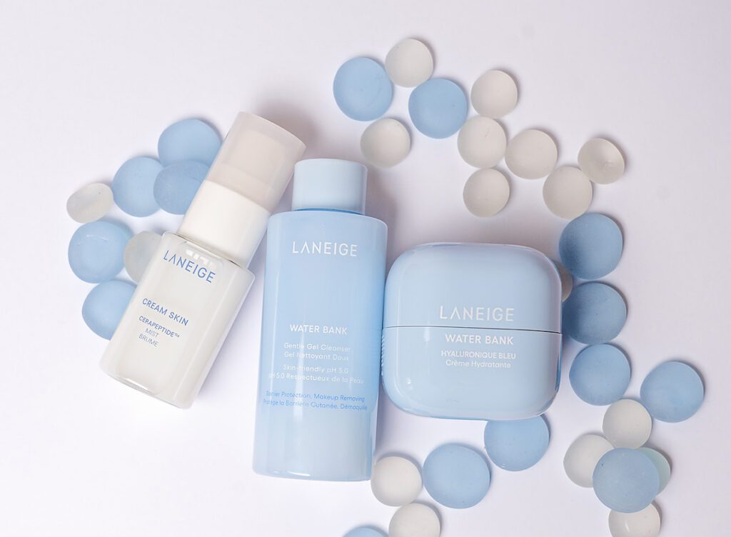
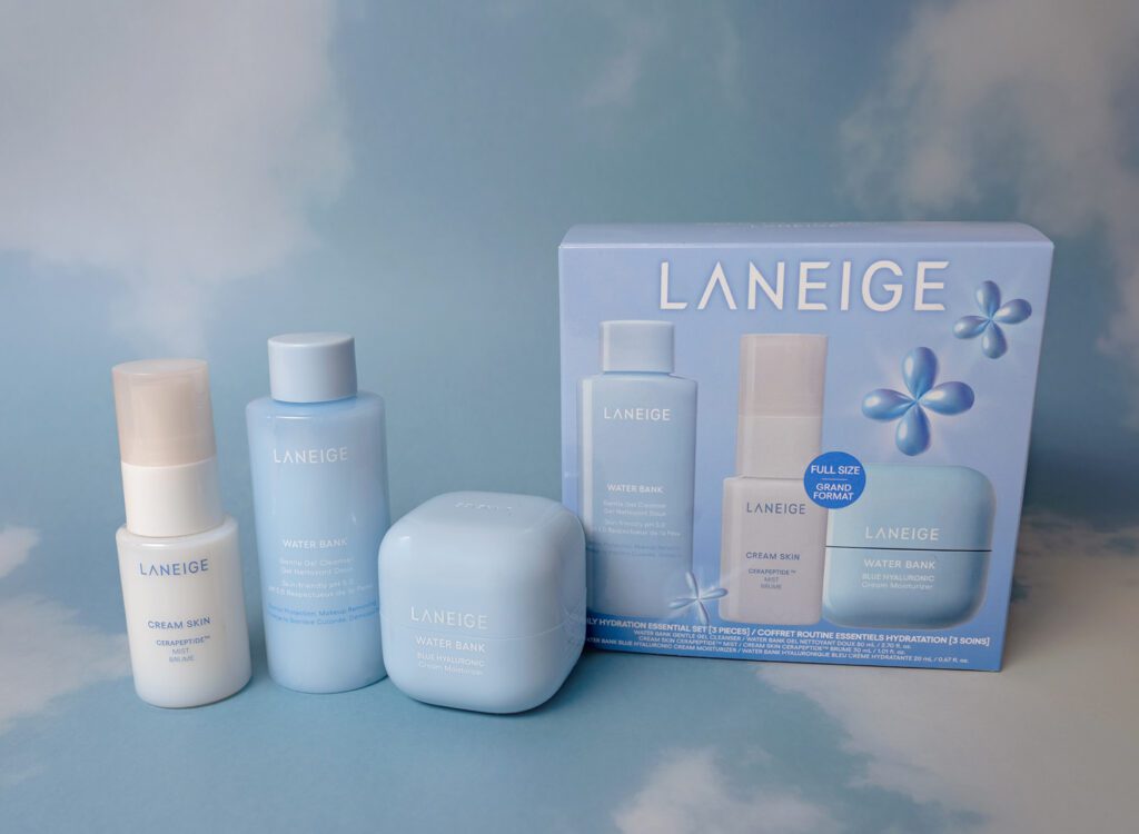
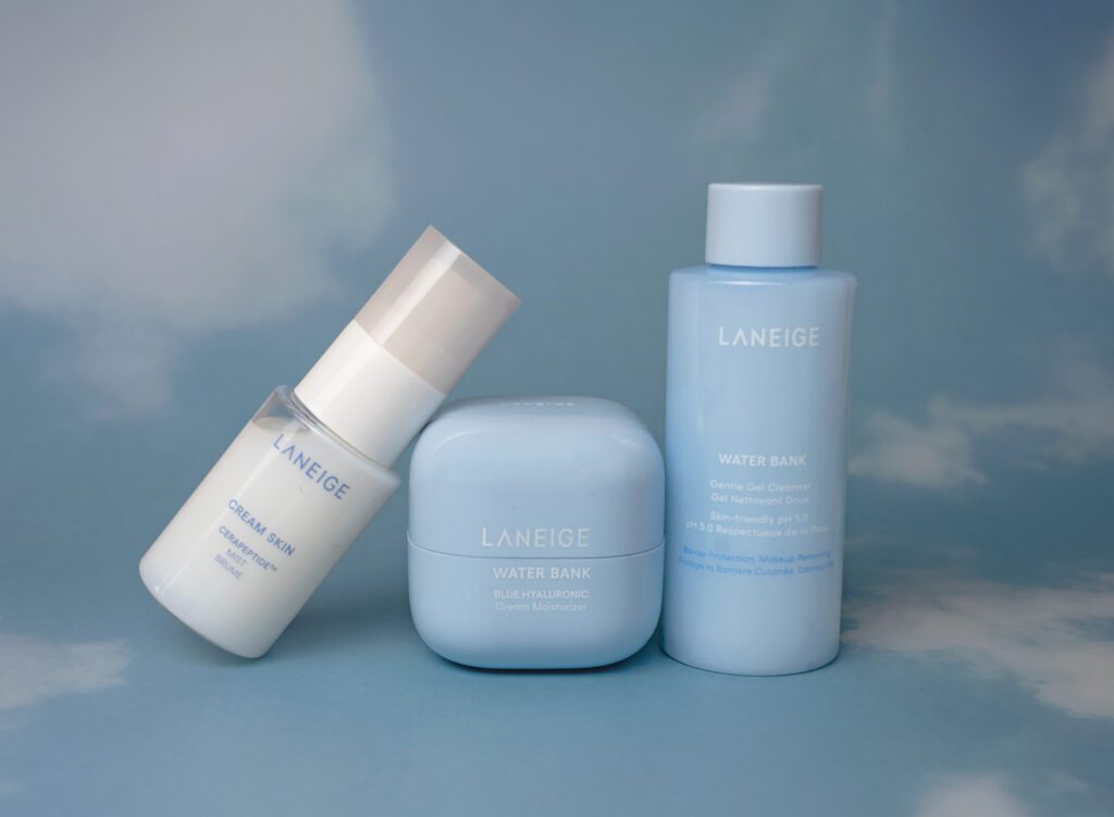
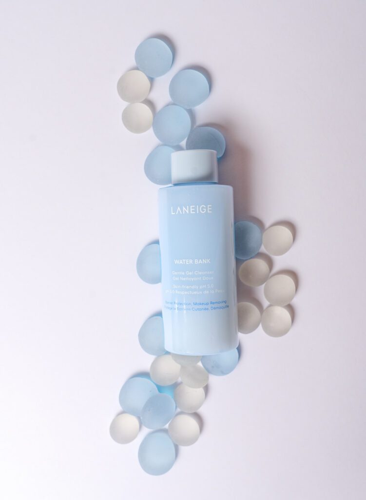
A Simple Study in Light Blue + White
There’s something about skincare brands that feels instantly calming when it’s done right.
Soft colors. Clean packaging. A sense of ease before you even open the product.
That’s exactly what drew me to Laneige.
Their light blue tones paired with white and soft neutrals feel fresh, modern, and quietly elevatedwithout trying too hard.
So I decided to create a personal product photography project inspired by that aesthetic.
What Makes Skincare Product Photography Feel “Fresh and Clean”?
When people search for skincare product photography, what they’re often really looking for is a feeling.
Fresh. Clean. Hydrated. Calm.
To create that visually, it comes down to a few intentional choices:
- Soft, diffused lighting that eliminates harsh shadows
- A light color palette (white, off-white, pale blue tones)
- Minimal, thoughtful styling that lets the product breathe
- Clean compositions that feel effortless and not cluttered
These aren’t complicated setups, but they are intentional.
And that intention is what separates a quick photo from a brand image that actually connects.
The Power of Light Blue and White in Skincare Branding
Color plays a bigger role than most brands realize.
Light blue is often associated with hydration, calm, and clarity. When paired with white or soft neutral tones, it creates a visual language that feels trustworthy and refined.
For this project, I kept everything simple:
- White and off-white backdrops
- Soft blue accents to mirror the product packaging
- Gentle shadows to maintain depth without heaviness
The goal wasn’t to over-style and it was to create space for the product to stand on its own.


Why Clean Product Photography Works So Well for Skincare Brands
When your product promises clarity, hydration, or simplicity, your visuals should reflect that.
Clean product photography:
- Builds instant trust with your audience
- Makes your product feel higher-end and intentional
- Keeps the focus on what matters; your product
- Creates a consistent, recognizable brand look
It’s not about doing more. It’s about doing less, better.
A Personal Project (and Why It Matters)
This wasn’t a paid shoot.
It was a personal project creating an opportunity to explore a brand aesthetic I genuinely love. My vision was to create visuals that feel aligned with where many skincare brands are heading right now.
Because here’s the truth: brands don’t just need photos.
They need visuals that feel like them.
And sometimes the best way to show that is to create it first.
Imagine This Look for Your Brand
If your skincare brand leans into soft tones, clean ingredients, or a minimal aesthetic, your photography should reflect that same feeling.
Imagine your website, product pages, and social content all carrying this same calm, cohesive look. All the images that feel fresh, elevated, and instantly recognizable.
That’s the difference intentional product photography makes.
Let’s Create Something That Feels Like Your Brand
If you’re ready for product photography that feels aligned, clean, and thoughtfully styled then I’d love to be part of your creative team.
Whether you’re building your brand from the ground up or refining what you already have, we can create visuals that reflect the quality and intention behind your products.
👉 Reach out to start planning your skincare product photography
Because your product already has a story. Let your visuals tell it.
To get started complete the form below or drop us a text or call. 248-924-9584
Your message has been sent